Project
Was to redesign the current product page to improve the page conversion, then release the layout changes in stages from top to bottom, all design is data-driven and A/B split tested for success.
Research
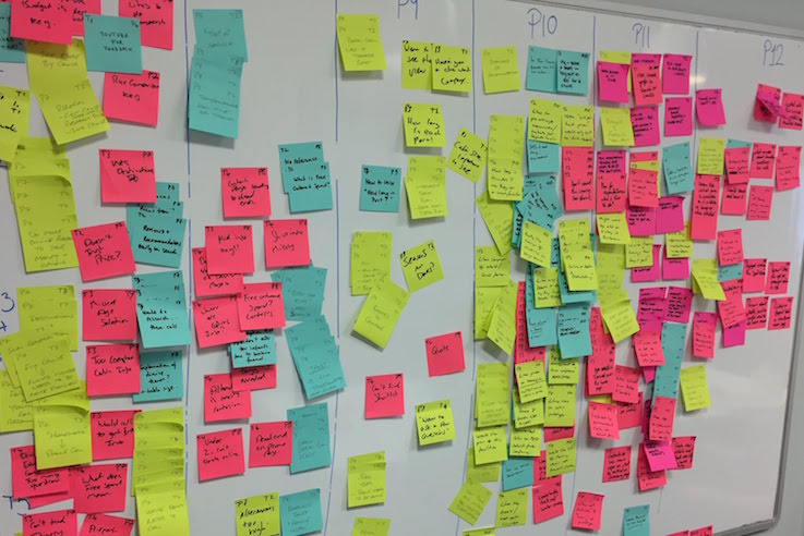
I researched using Baymard documentation and also we used Webcredible, User Testing workshops to see how the user interacts with the page and to define the problems!

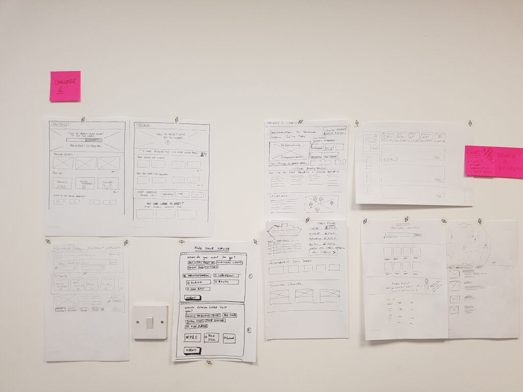
Then with the findings we sketched initial concepts within a Crazy 8’s Design Sprint and created UX Prototypes before deciding on a solution to develop further as a UI Design. for team review and Google catch-ups. Develop concepts further using their feedback.
Collaboration
Working within the Search & Landing pages team, The project consists of one Project Owner, UX/UI Designer and two Developers, doing Design Sprints and reviews within the Product & Design Team and a bi-weekly catch up with Google
BEFORE

AFTER

Itinerary page redesign updates
Firstly launch the top section, then test one element at a time, evaluate the results and then make necessary changes. Then move to the next most important area and repeat the process.
- Use a clear navigation structure, larger UI design elements, a lot of whitespaces rather than compacting it! Use a minimum of 16px font size to be easy-to-read. Use bold to emphasize content, and avoid using italic. Avoid long blocks of text by breaking copy into chunks wherever possible.
- Content architecture: Displaying the data when the user expects to see it rather than all in one go is confusing to the user!
- We gave the page more clear Calls-to-Action and promotion messages to look different rather a banner/button, which was causing a negative effect
- User familiarity and anticipates certain design patterns when navigating through a website.
Results
Increased the product page conversion rate

