Project
Within the Product & Design team, we wanted to create reusable components and modules library that we could use on other landing pages, to achieve this we created the UX/UI designs for the cruise ship pages.
Research
Gather requirements from the JIRA ticket, use Task analysis to break into smaller and more manageable tasks, for myself and Software Developers, discussing options with the Head of SEO and Marketing team.
UX Research methods for the product cycle from Discover > Explore > Test > Listen
Regularly trying and finding the UX research methods that work best for Iglu Cruise. Some methods may be more appropriate than others, depending on time constraints.
Everything we did was user-centred, backed up by research and design techniques. We reviewed user behaviour videos, analytics and heatmaps using Hotjar or Contentsquare on the current content pages. Analyze competitors websites.
When released as an A/B split test for success, run an online survey for feedback!
Collaboration
Working within the Search & Landing pages team, The project consists of one Project Owner, a UX/UI Designer and two Developers. Product & Design Team reviews throughout the key stages of the process!
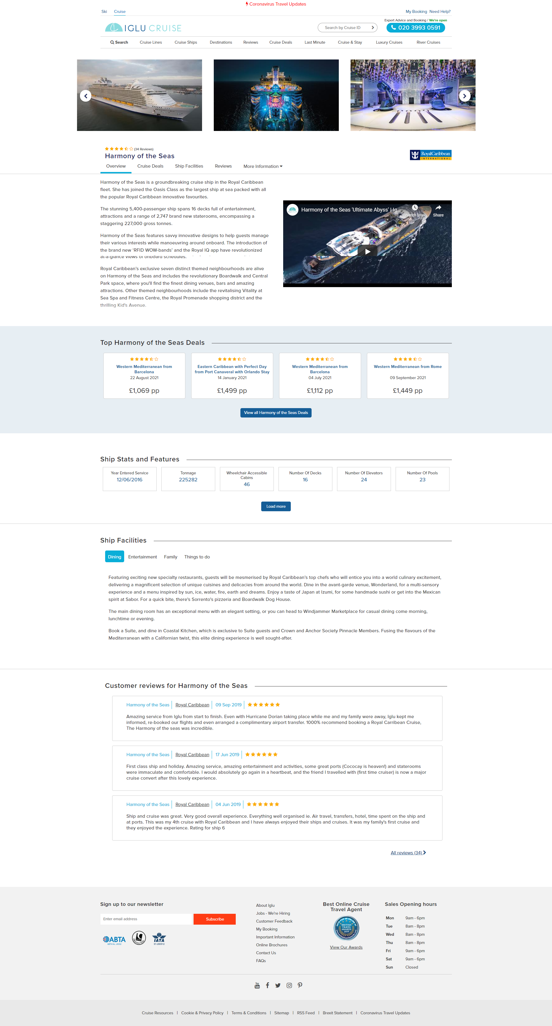
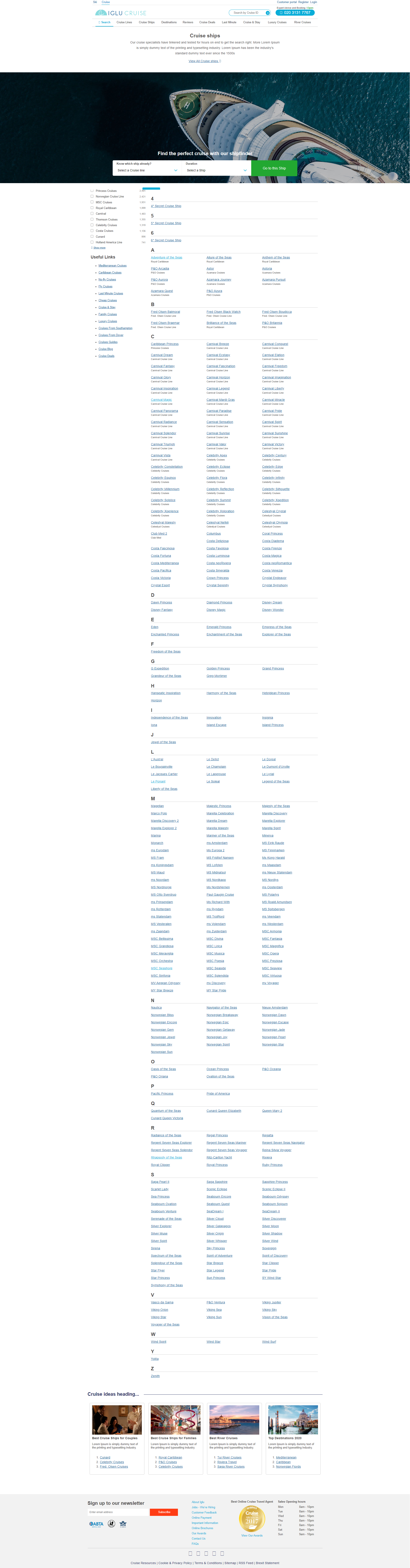
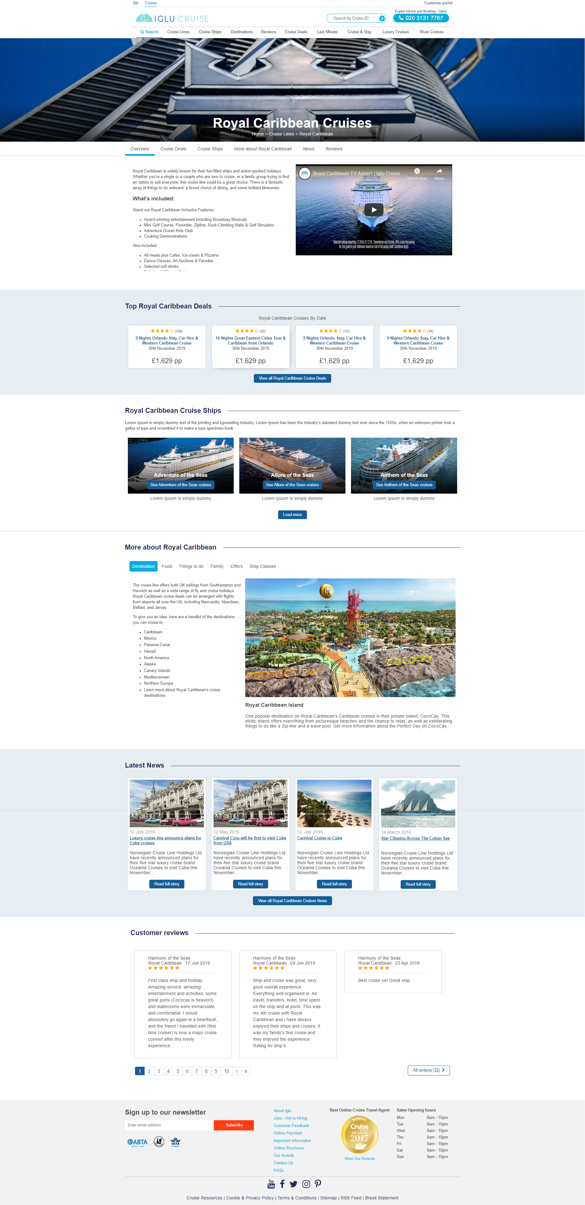
UX Design for the Cruise ship page
UX Research Methods: Site Audit of what components and modules we have, Competitors Analysis, used SketchApp to create the UX Wireframes
- User interaction only provided a very low conversion rate
- We needed only one clear conversion goal of getting a new user into the search pages, and then make sure every element of your page supports this conversion goal.
- The one CTA (call-to-action) button always visible, so the user can decide any time.
- We needed to break up long content with subheadings, bullets and improve formatting to make it easier to read.


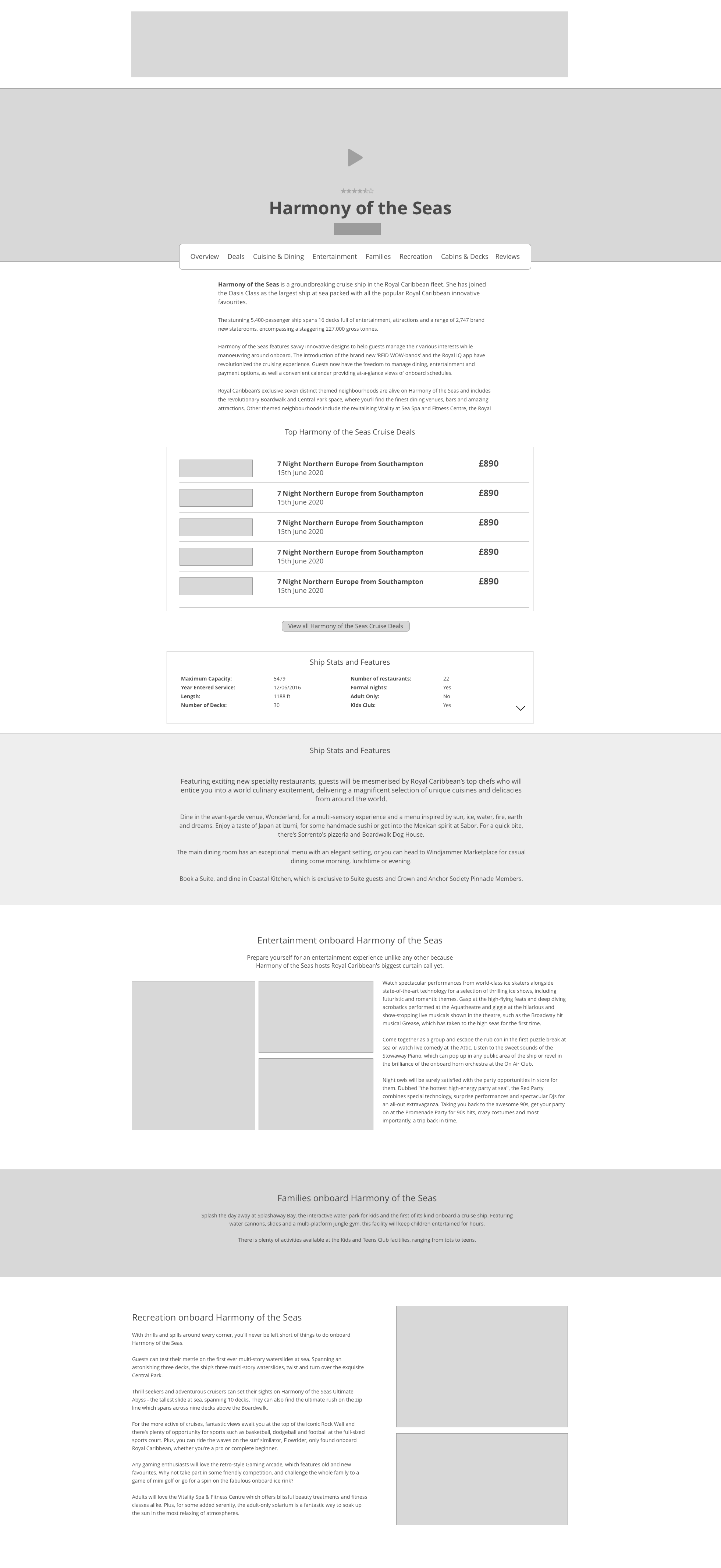
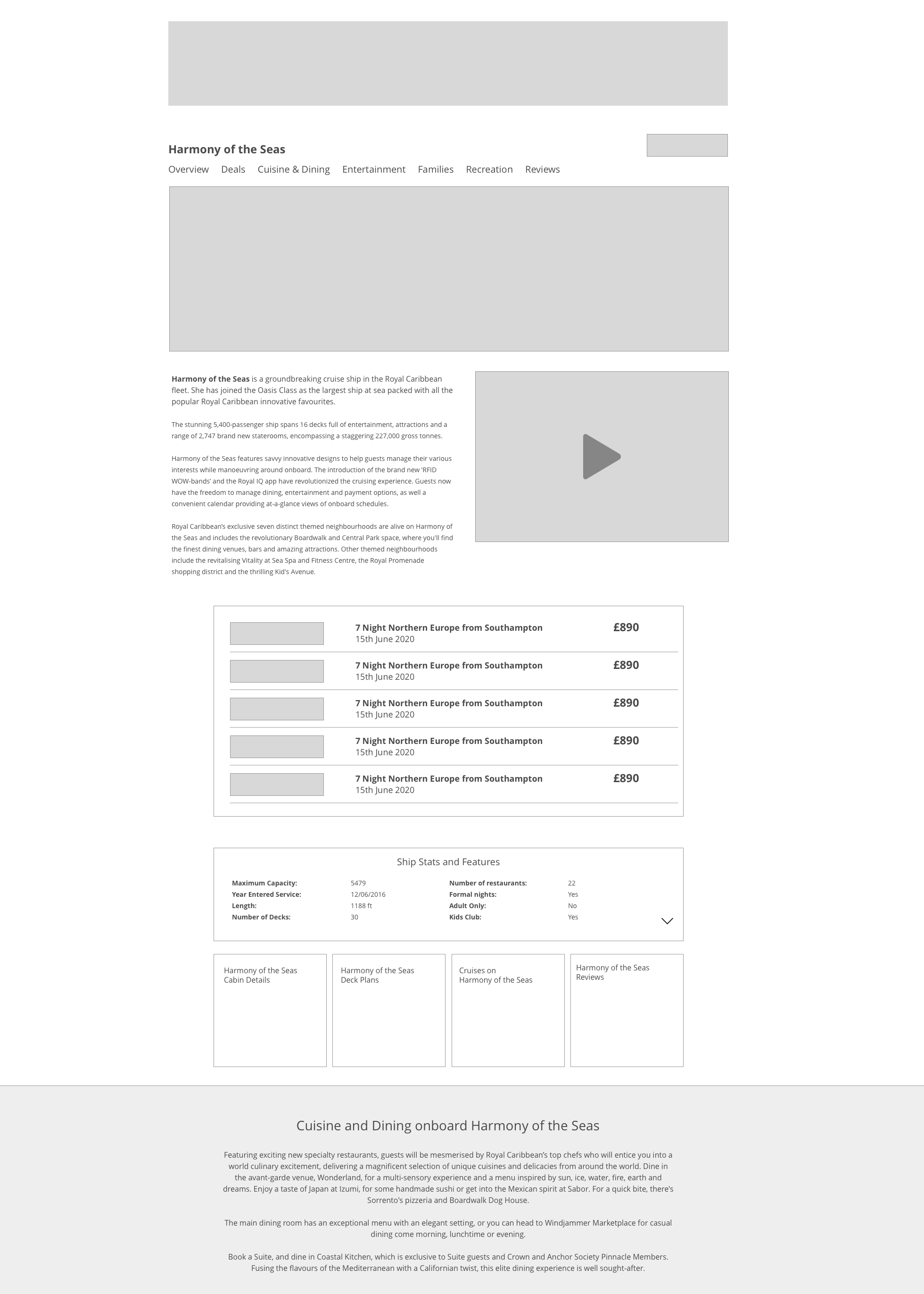
UI Design for the Cruise ship page
I decided it was more structured with the use of the components and modules! I started with the areas that had the greatest potential to improve conversion rates.
- I increased the font size and spaced out so it’s easier to read
- Developing a Style Guide within the Design Team for UI components and modules, Typography, Buttons, Colour Palette
- Example: Added pulse animation on buttons that will work on all devices so the user knows when they have clicked, CSS hover effect won’t work!
- Designed and built reusable Components and Modules Library which use there own individual style sheet so can update once and will update throughout the website
Prototype
Cruise ship page concepts
Changes to the HTML/CSS structure which increased Google natural search results views by 20% on landing and content pages. This result initiated the design and build of a reusable Atomic Design system for components and modules.
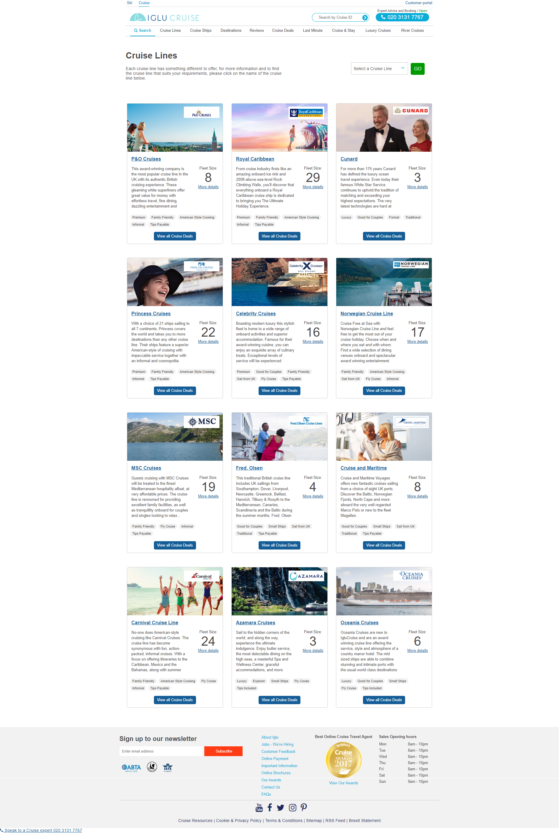
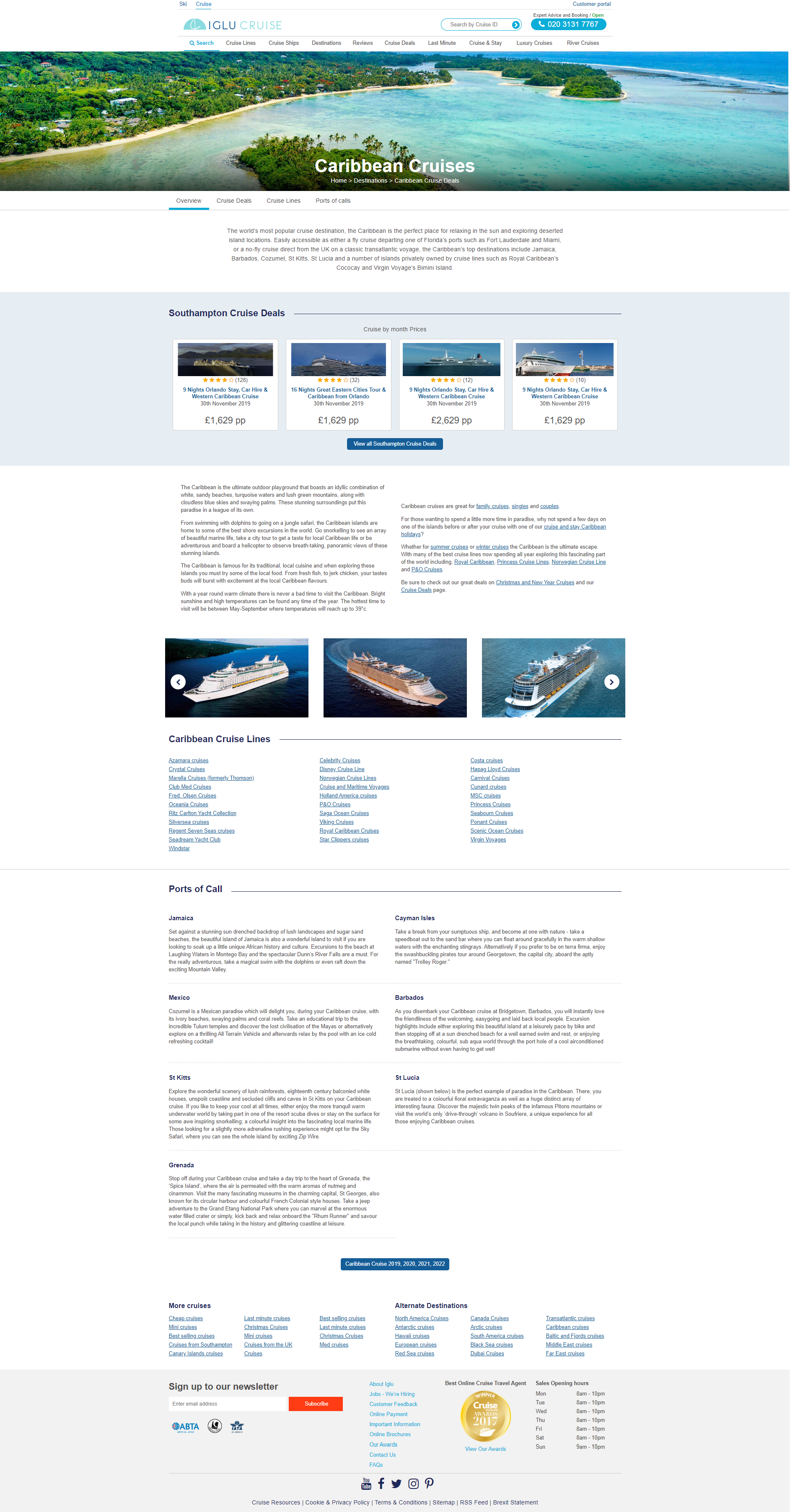
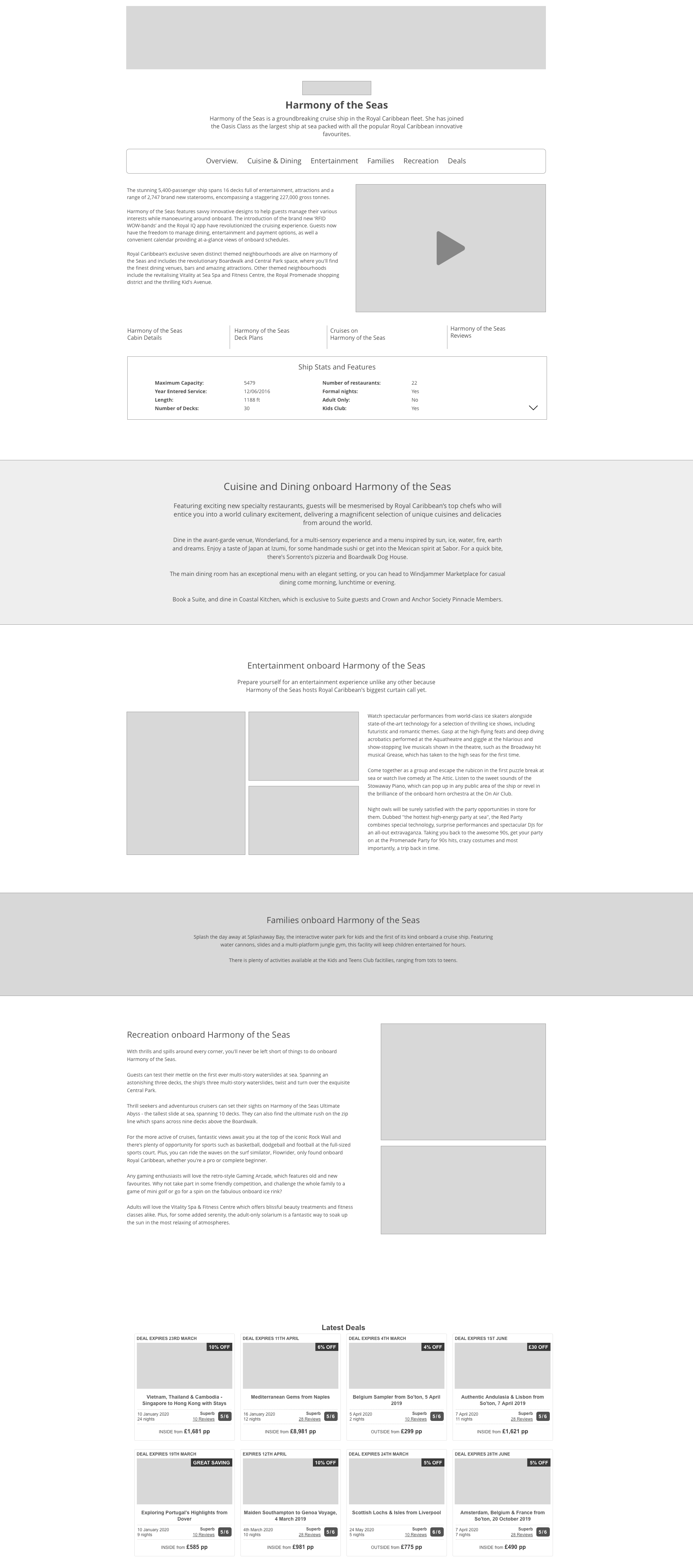
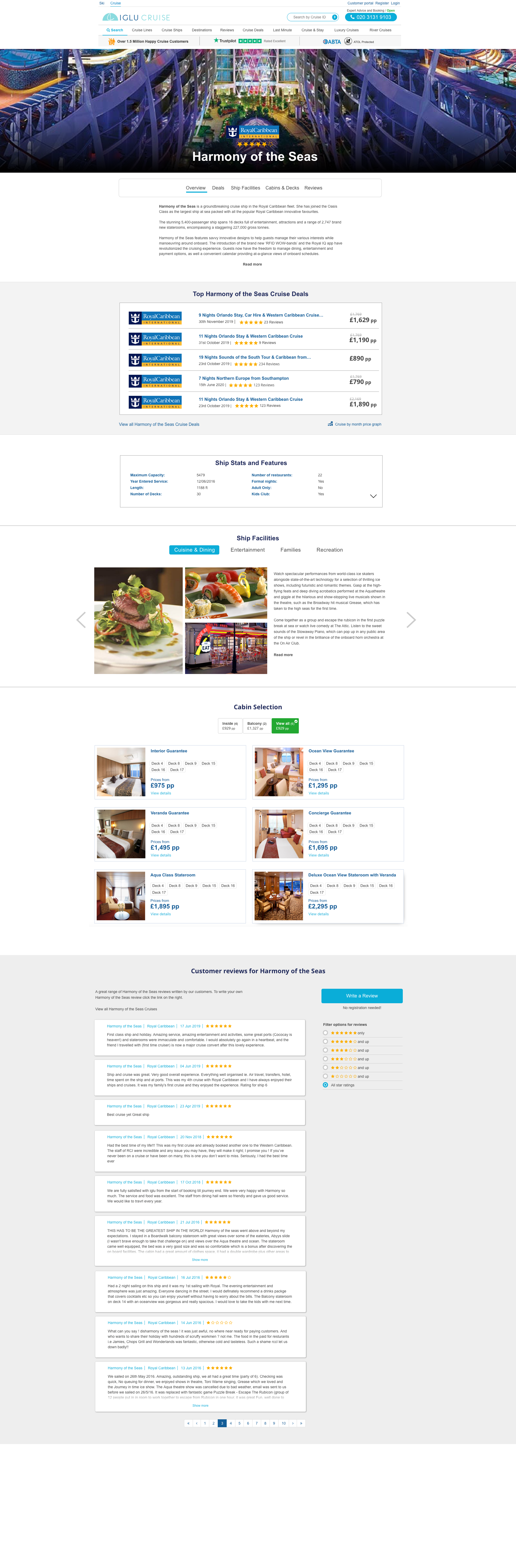
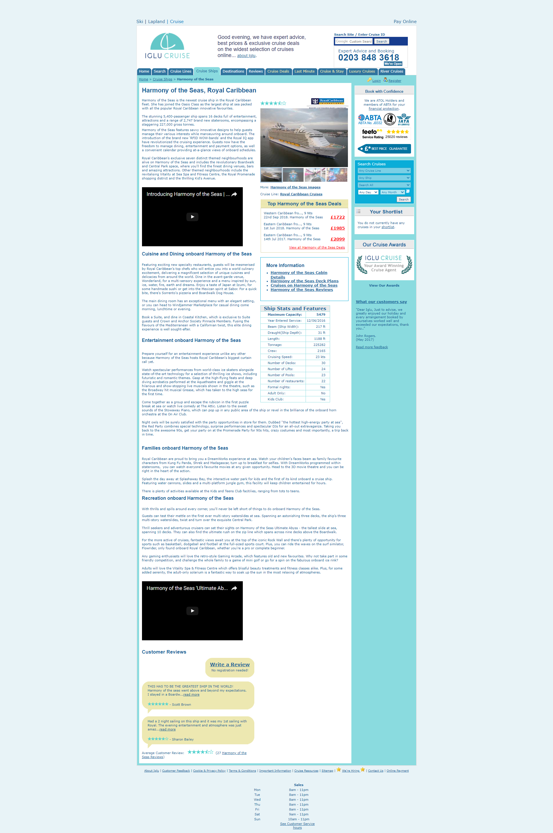
BEFORE
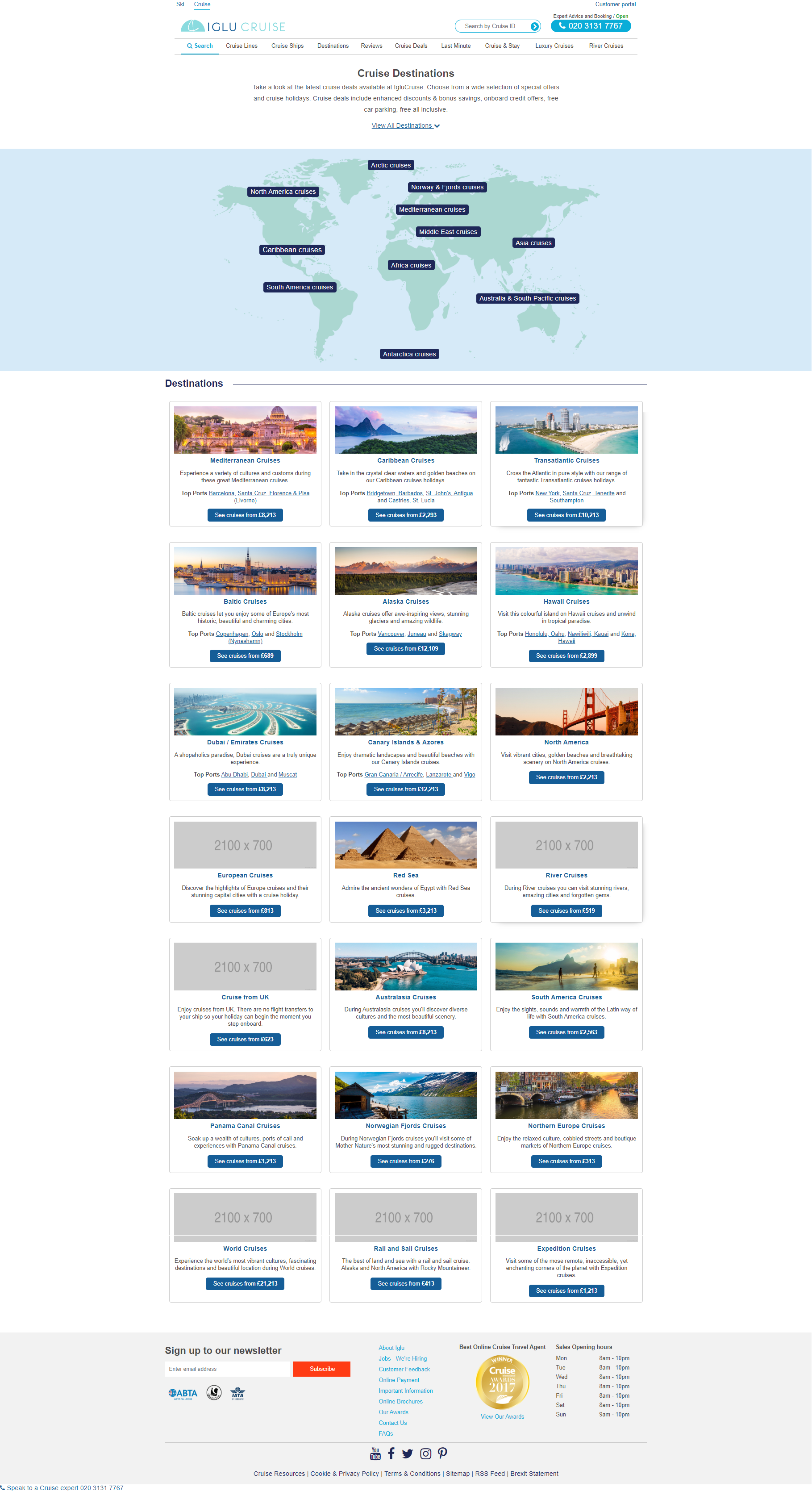
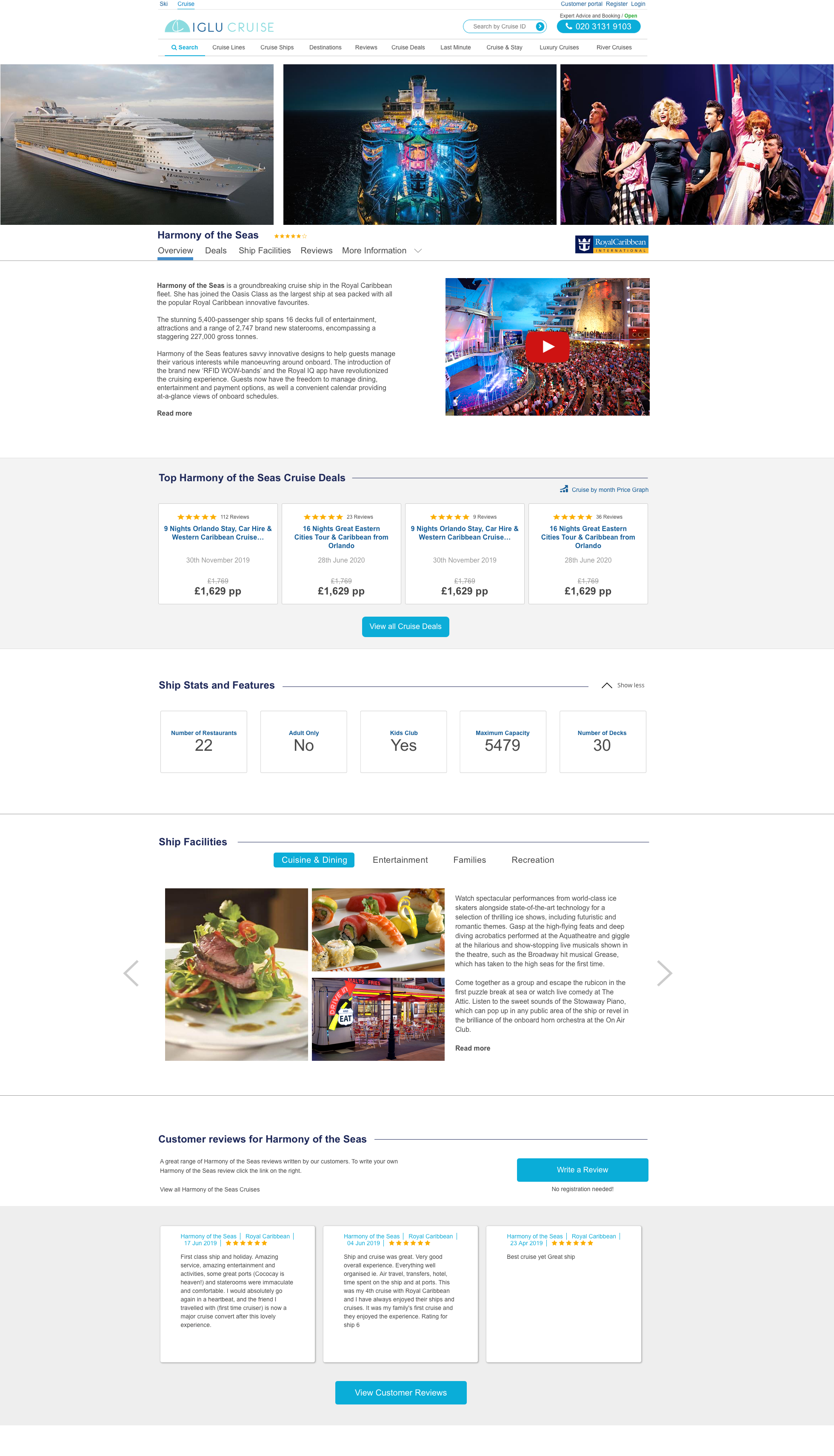
AFTER
MOBILE VIEW
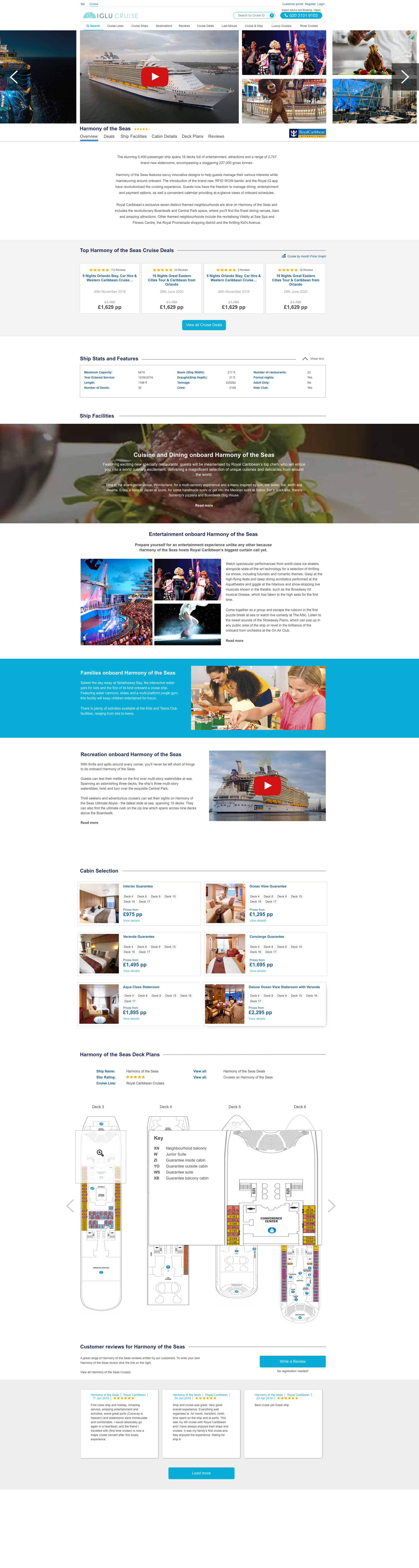
OLD VERSION
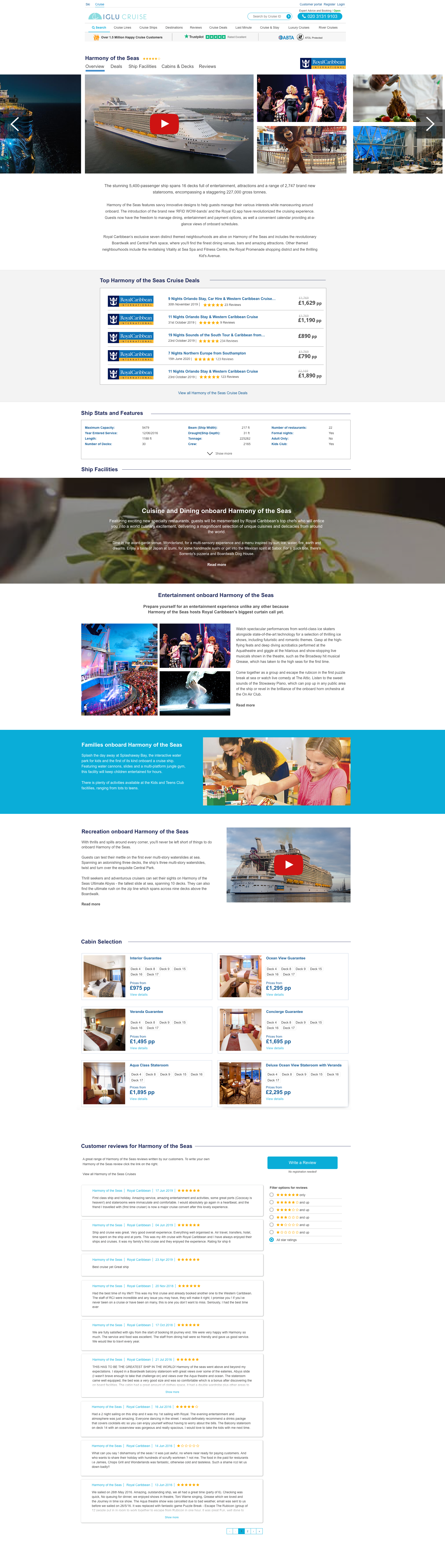
NEW VERSION
UI Designs of the other content pages